Process Mining - Getting Started
Last updated 2 months ago
Your business events already tell a story, an invoice moving from creation to payment, a case moving through approval steps. The Process Mining Flowchart turns that raw event log into a clear visual map, so you see the story instead of guessing at it.
ℹ️ Here's how it works: each box is a step in your process (an "Activity"). Each arrow shows how often cases actually move from one step to the next. No modeling background needed, no guesswork. Just your real process, visualized.
💡Use it to find answers like:
Where do most cases go, and where do they stall?
Which step is quietly eating up the most time?
Are cases skipping steps or looping back to redo work?
How does the process differ across vendors, regions, or departments?
This guide walks through setup and every feature, in plain language, so you're up and running fast.
Setting up the visual
Required fields
The visual needs three fields to draw anything. Drag them into the field settings on the right:
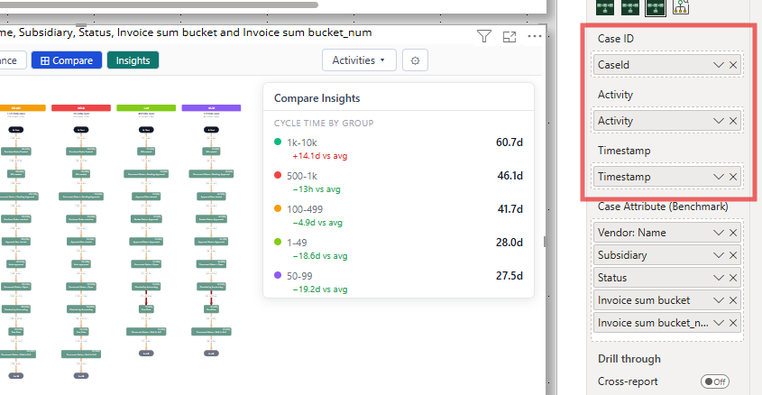
Until all three are filled in, the visual shows a message asking for them, this is expected.
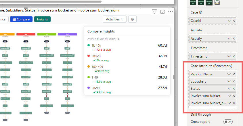
Optional fields
Configuring the visual (Format pane)
Select the visual, then open the Format your visual pane in Power BI.
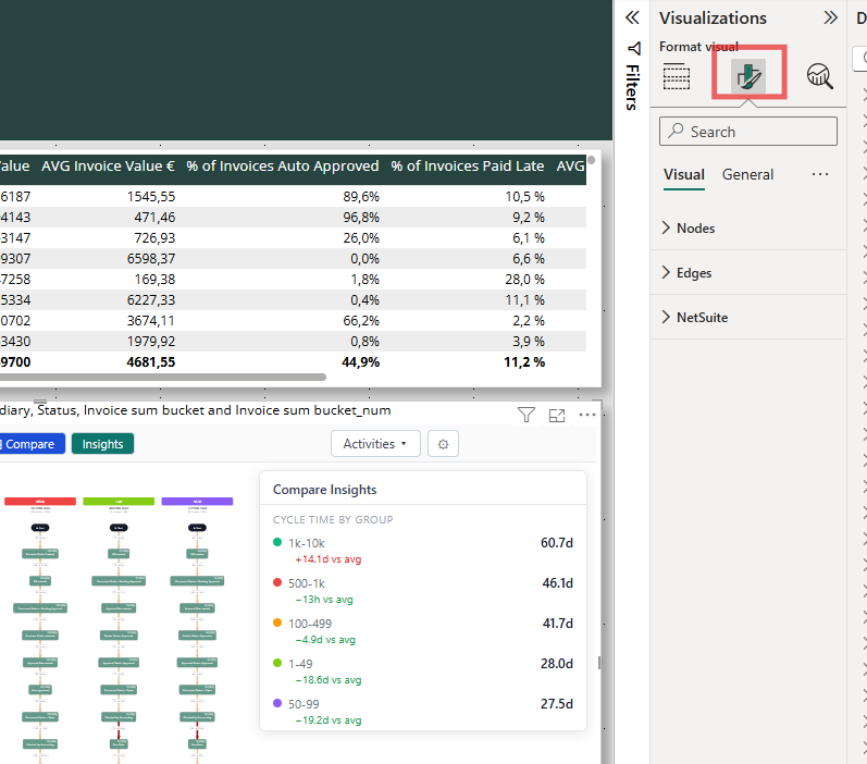
Nodes
Edges
NetSuite (optional, advanced)
Note: Font color for activity labels is not currently exposed in the Format pane, the visual automatically switches between light and dark text for readability against each box's background color.
How much data can it handle?
There's no hard row limit, the visual keeps requesting more data from Power BI until it has it all, and shows a "Loading data..." message with a running row count while it does. Very large logs will simply take a little longer to load. If loading feels slow, consider using the Sample control (see Interacting with the Visual) to work with a representative subset while exploring.
Was this helpful?
Still need help? Ask the team